# Buttons

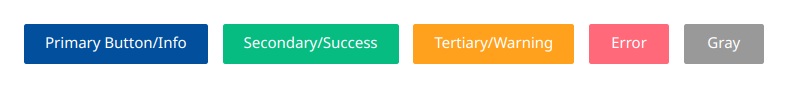
Our button component in the Sunbird-Ed portal utilizes the `sb-btn` class as the default style. It's versatile, with variations available in primary, secondary, warning, error, and gray colors, each represented by specific classes like `sb-btn-primary`, `sb-btn-secondary`, and others.

<figure><img src="https://3233010154-files.gitbook.io/~/files/v0/b/gitbook-x-prod.appspot.com/o/spaces%2F-MkgPDmvKwE_DgYJbvPS%2Fuploads%2FkkIDpyC7FLXqEqufqrZd%2Fimage.png?alt=media&#x26;token=6daffbed-0909-4b7f-9088-4f22349768c9" alt=""><figcaption></figcaption></figure>

**Outline Button Variation:**

We offer an outline button variation to provide a different visual style. These are denoted by classes like `sb-btn-outline-primary, sb-btn-outline-secondary` and others.

<figure><img src="https://3233010154-files.gitbook.io/~/files/v0/b/gitbook-x-prod.appspot.com/o/spaces%2F-MkgPDmvKwE_DgYJbvPS%2Fuploads%2FNpMtI3d59XbNa8qXRjut%2Fimage.png?alt=media&#x26;token=f17548db-5f77-4751-b76f-842c0c342369" alt=""><figcaption></figcaption></figure>

**Size Variations:**

Our button component supports various sizes to cater to different layout requirements. These sizes are represented by classes such as `sb-btn-xs`, `sb-btn-normal`, `sb-btn-sm`, `sb-btn-md`, and `sb-btn-large`.

<figure><img src="https://3233010154-files.gitbook.io/~/files/v0/b/gitbook-x-prod.appspot.com/o/spaces%2F-MkgPDmvKwE_DgYJbvPS%2Fuploads%2Fs1k4iHtkNmZJu3T3K5J9%2Fimage.png?alt=media&#x26;token=9c786104-31d6-46fd-8a74-869ae05f9b93" alt=""><figcaption></figcaption></figure>

**Theme Variations**

Incorporating the Joy theme, we've made specific modifications to the button component to align with its vibrant and engaging visual style.

<figure><img src="https://3233010154-files.gitbook.io/~/files/v0/b/gitbook-x-prod.appspot.com/o/spaces%2F-MkgPDmvKwE_DgYJbvPS%2Fuploads%2FRpnN68nAE6LAV1hyr9gz%2Fimage.png?alt=media&#x26;token=a1648c06-fe38-48b6-815c-bb6aabe2392d" alt=""><figcaption></figcaption></figure>

Example of how to use classes for buttons

```
<button type="button" class="sb-btn sb-btn-primary sb-btn-normal">Primary Button/Info</button>
<button type="button" class="sb-btn sb-btn-outline-primary sb-btn-normal">Primary Button/Info</button>
```

For more information please refer to this link: <https://sunbird-ed.github.io/sunbird-style-guide/dist/#/buttons>
